Build Animated Social Media Icons Using HTML and CSS
- html
- css
- animations
- social-icons
- frontend
- portfolio
1 min read
Ritik Tiwari
Animated UI elements can make even simple websites feel interactive and polished. In this tutorial, we’ll build animated social media icons using only HTML and CSS.
This is a great mini-project to showcase in your portfolio or reuse in landing pages, personal websites, or footer sections.
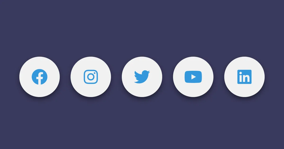
What We Are Building
Features:
- Circular social media buttons
- Hover animations
- Icon scaling effects
- Rotation interaction
- Pure CSS micro-interactions
Great for:
- Portfolio websites
- Landing page footers
- Profile cards
- Personal websites
HTML Code
<!-- index.html -->
<!DOCTYPE html>
<html lang="en">
	<head>
		<meta charset="UTF-8" />
		<meta name="viewport" content="width=device-width, initial-scale=1.0" />
		<link rel="stylesheet" href="style.css" />
		<script src="https://kit.fontawesome.com/767a85f1ee.js" crossorigin="anonymous"></script>
		<title>Social Media Icons</title>
	</head>
	<body>
		<div class="wrap">
			<a href="https://www.facebook.com/theritiktiwari/" class="btn" target="_blank">
				<i class="fab fa-facebook"></i>
			</a>
			<a href="https://www.instagram.com/theritiktiwari/" class="btn" target="_blank">
				<i class="fab fa-instagram"></i>
			</a>
			<a href="https://twitter.com/theritiktiwari" class="btn" target="_blank">
				<i class="fab fa-twitter"></i>
			</a>
			<a
				href="https://www.youtube.com/channel/UCaTiS60yVc1MJods9sFFtuw"
				class="btn"
				target="_blank"
			>
				<i class="fab fa-youtube"></i>
			</a>
			<a href="https://www.linkedin.com/in/theritiktiwari/" class="btn" target="_blank">
				<i class="fab fa-linkedin"></i>
			</a>
		</div>
	</body>
</html>
CSS Code
/* style.css */
body {
	margin: 0;
	padding: 0;
	background-color: #3a3a5d;
}

.wrap {
	position: absolute;
	top: 50%;
	transform: translateY(-50%);
	width: 100%;
	text-align: center;
}

.btn {
	display: inline-block;
	width: 90px;
	height: 90px;
	background-color: #f1f1f1;
	margin: 10px;
	color: #3498db;
	box-shadow: 0px 5px 15px -5px #000;
	border-radius: 50%;
}

.btn i {
	font-size: 36px;
	line-height: 90px;
}

.btn i:hover {
	transform: scale(1.3);
	color: #fff;
}

.btn:hover {
	background-color: #3498db;
	animation: animate 1s;
}

@keyframes animate {
	0% {
		transform: rotate(180deg);
	}
}
Video Tutorial
Related Posts
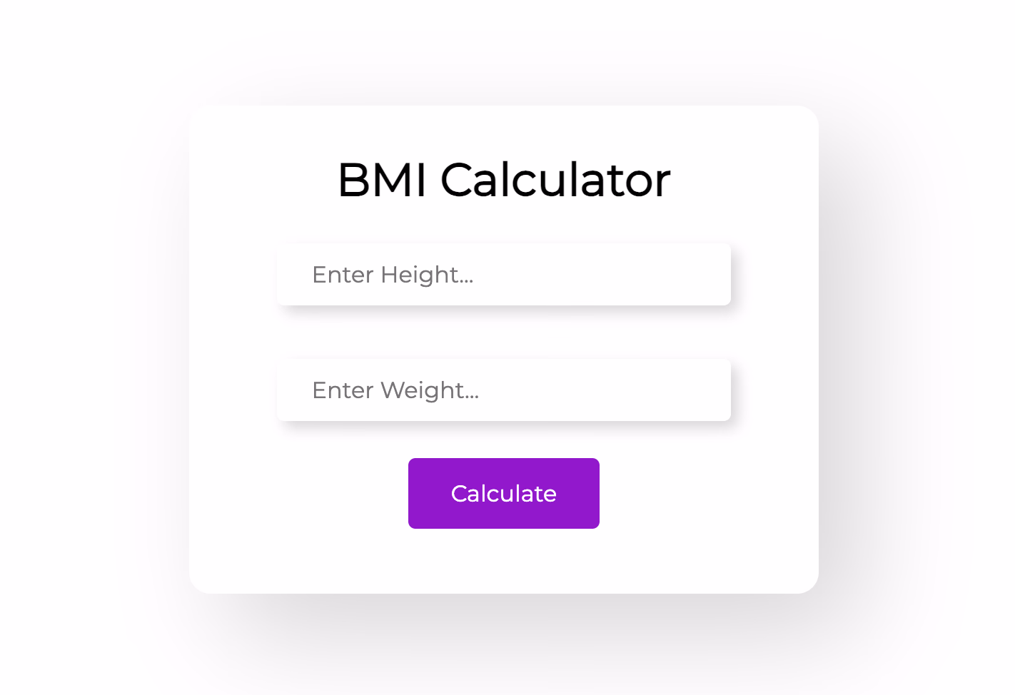
Build a BMI Calculator Using HTML, CSS and JavaScript
Learn how to build a beginner-friendly BMI Calculator using HTML, CSS and vanilla JavaScript.
Jul 20211 min read
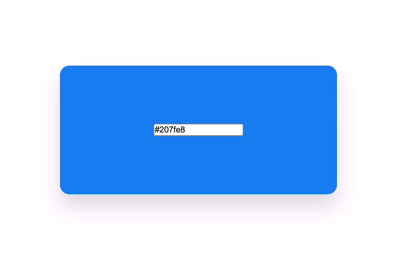
Build a Hex Color Generator Using HTML, CSS and JavaScript
Learn how to create a simple hex color generator and live preview tool using vanilla HTML, CSS and JavaScript.
Jul 20211 min read
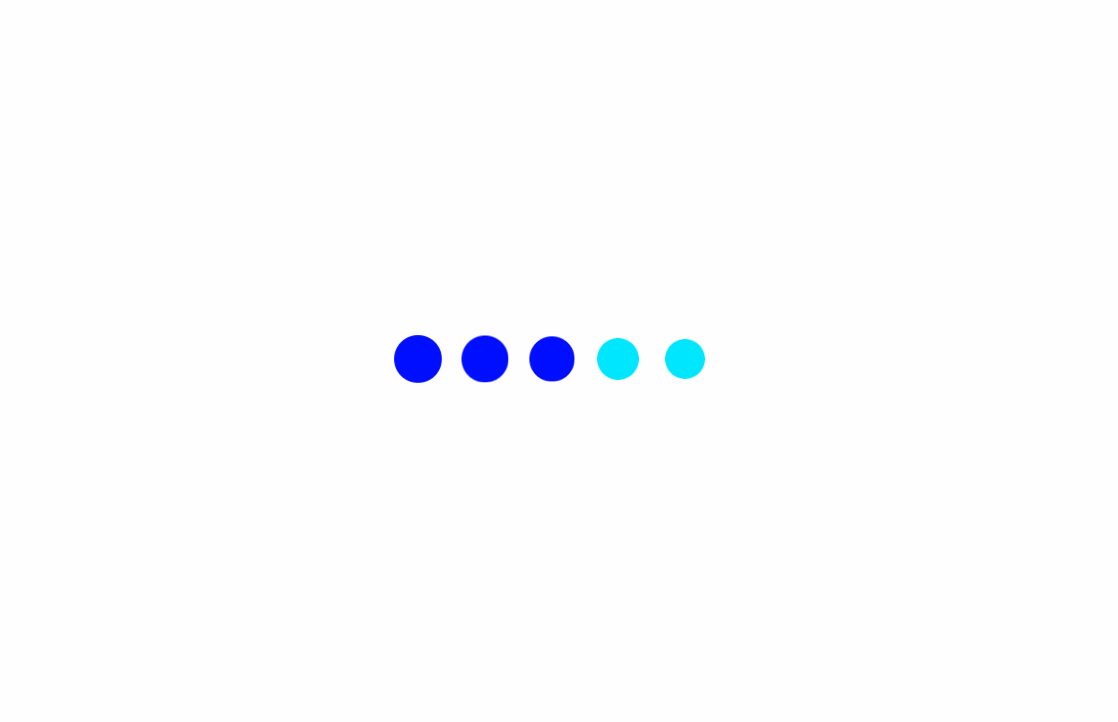
Create a PayTM Loading Animation Using HTML & CSS
Learn how to recreate a PayTM-style loading animation using pure HTML and CSS with a live demo and step-by-step explanation.
Sep 20201 min read